How I manage low budget projects. Detectoku - case study
Kasia Kosobucka
11/12/20244 min read
I often work with board game publishers and indie game designers on bigger and smaller projects. I work based on hourly rate, rarely based on the project quotation. From time to time I get some fun but really small commissions. I always try to accommodate my clients as well as it's possible.
That's why when I've got an e-mail from Hiroji Osaka in April 2024, who asked me if I would be willing to make a small project, I was intrigued. I said that I work based on hourly rate and we realized that this project is on a tight budget. I said that I'd gladly want to work on that and we manage to reach a compromise. I was gonna work on hourly rate, but there will be a time limit. I made myself a challenge to make a good design in just few hours.
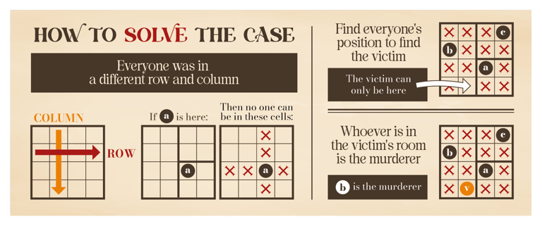
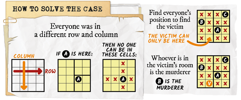
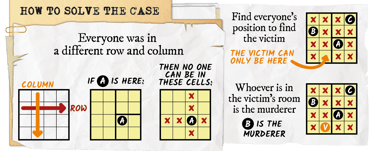
A little about the project: Murder Mystery puzzles were born from the mind of Hiroji Osaka in Spring 2020. They are inspired by whodunit stories, and two popular classic puzzles : the Sudoku, and the text-based logic grids.
All character art is made by Hiroji Osaka and Valentyna Bezdushna.
The project...
Context
1st commision - instruction to the game
I was supposed to redesign just How To Play instruction for the Murder Mystery puzzles, but it happen to be more, but about that later on. I've got an original instruction from Hiroji and based on that I prepared two versions of it.

v1
v2
Version 1 is in old newspaper style, and version 2 as a document folder. This stage of the design took me 3,5h. There were 4 rounds of corrections and making a black and white version of it. Summing everything up, this small instruction took me about 5h to finish. After all corrections instruction look like that:
v2.05 - final
2st commision - Detectoku logo
As I previously point out, my cooperation with Hiroji was supposed to end with the instruction, but later on I've got a mail with second commission. I was going to design a logo for the interactive game Hiroji designed based on Murder Mystery puzzles. I was asked to do 2 versions of it at first. I've got a logo Hiroji previously did, so I had a base I could redesign.
I prepared a few sketches of the icon that would be used in the logo and as a favicon on the web page of the game. I was looking for objects that are in the detective theme.
I've draw these sketches in Fresco on iPad and later on opened them in Photoshop on my computer. It's pretty easy to include Fresco into my workflow thanks to the Creative Cloud.
Hiroji asked for 2 versions of the logo, so I prepared 2 versions with a few color combinations each as you can see below.
1st iteration of the logo took me about 4h.
v1 and variations of it
v2 and variations of it
Hiroji liked font used in version 1, so we went with it. He asked me to design different type of hat than I did at first. Simpler as in version 2. First I used the same hat, and flatten the colors. I added a stroke similarly as elements in the puzzles.

Polishing the final logo took about an hour. So whole process of designing the logo took about 5h. Here is the final version of the logo:
Another iteration of v1
As you can, I changed shape of the detective hat and added depth by adding simple shadow underneath.
First design was done in Adobe Illustrator. Then it was polished in Photoshop.